Area St Ives
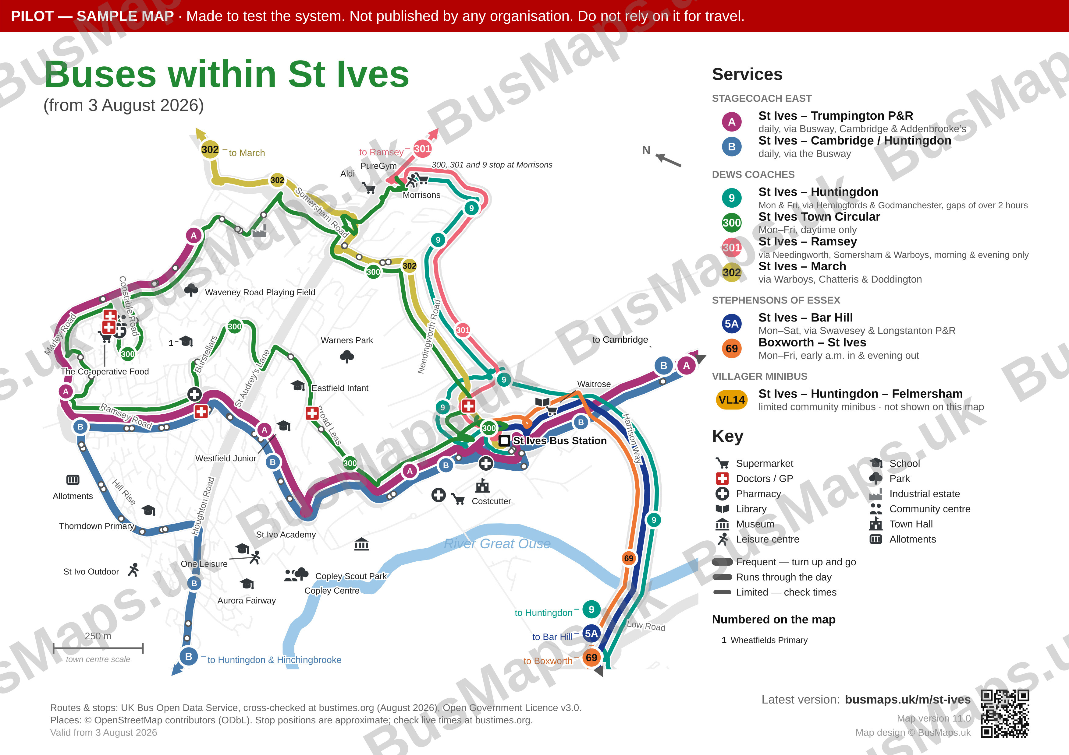
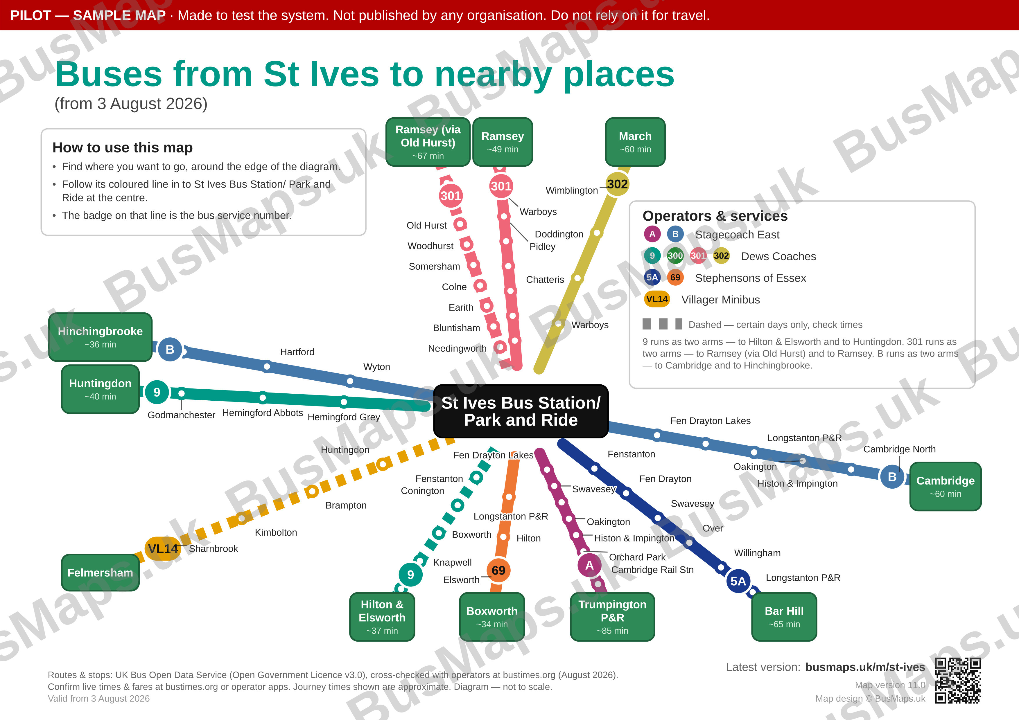
A whole-town map: every service within St Ives, plus where those buses go.
Outputs shown: internal (geographic) · external
A fixed showcase of what the system produces. These are maps we made ourselves to test and demonstrate it, and they are not maintained as live travel information — with one exception: the St Neots town centre map is now published by Love’s Farm Community Association under its own name. Everything that has been through the portal end to end is listed separately.
Genuine output of the system — nothing here is mocked up. Each shows an internal map (left) and an external map (right). Click any image to see it full size.
A whole-town map: every service within St Ives, plus where those buses go.
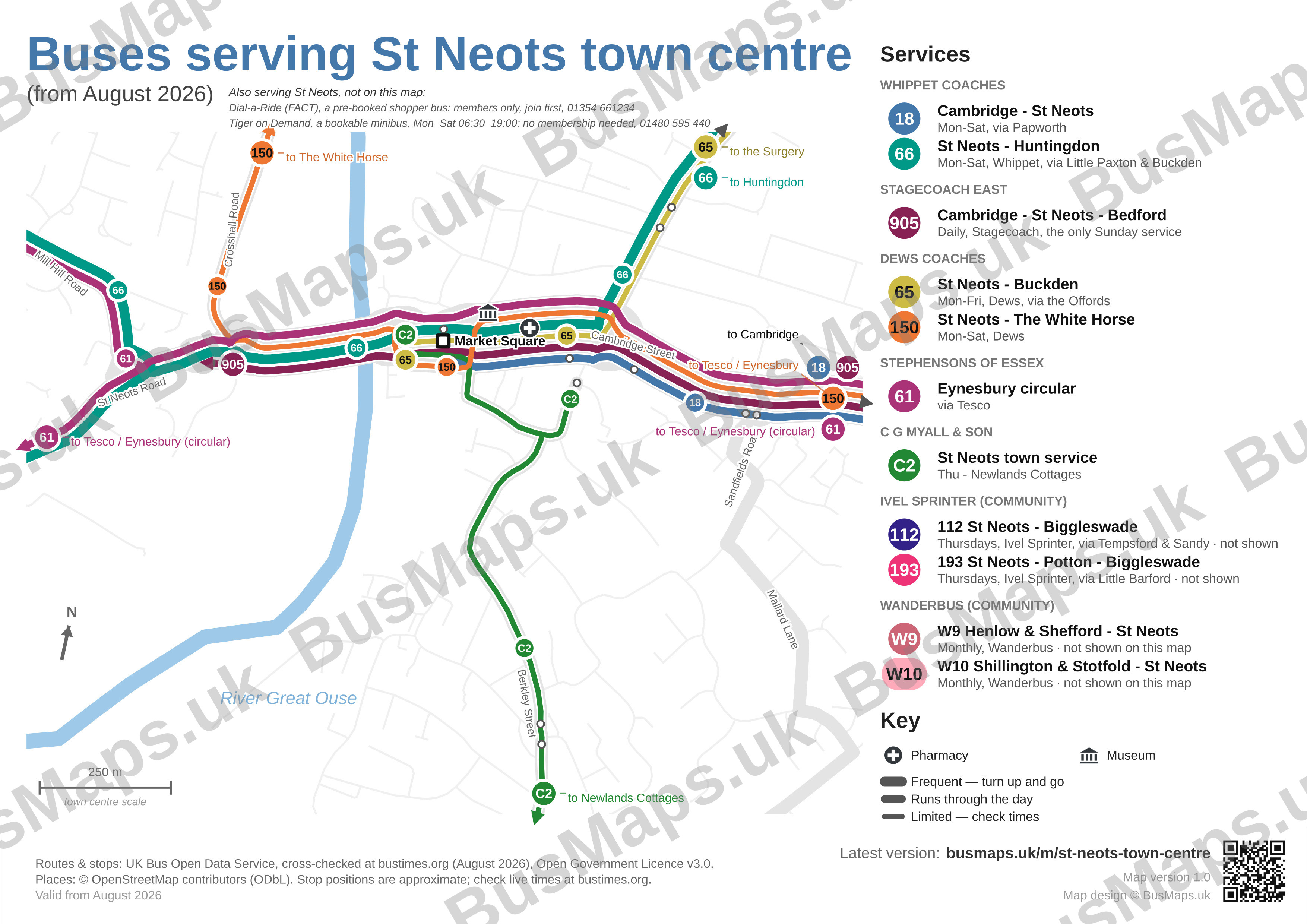
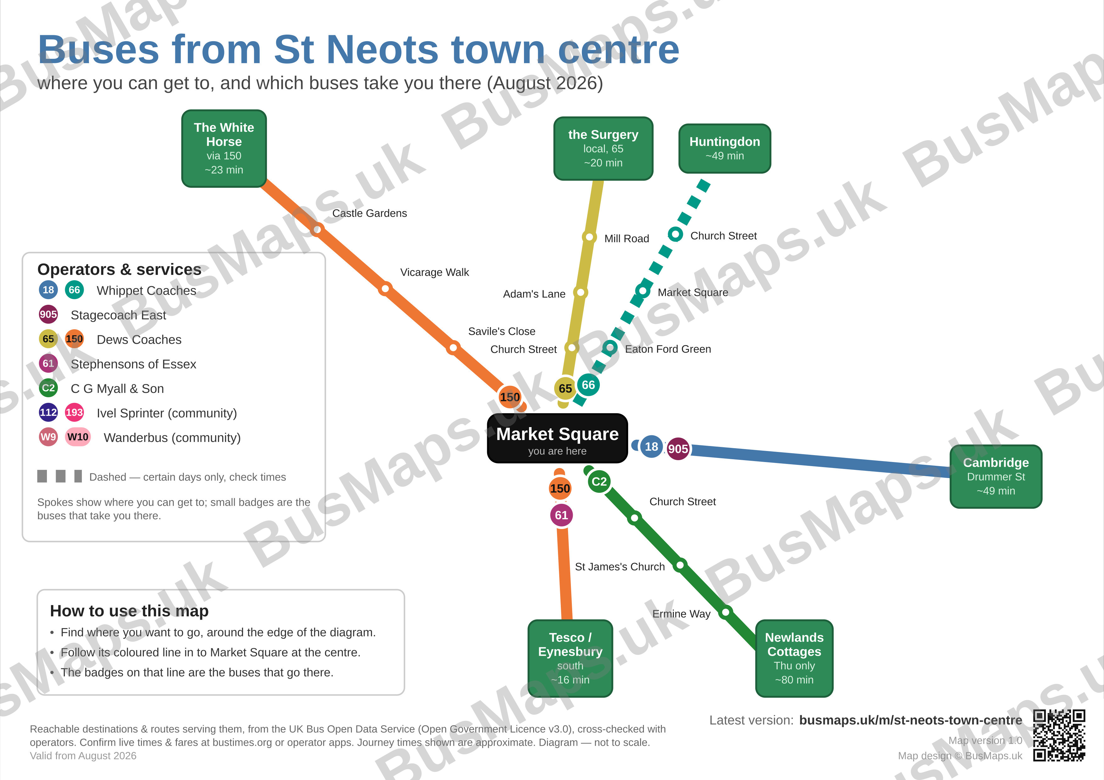
Centred on one point: the buses that serve the town centre and where they can take you.
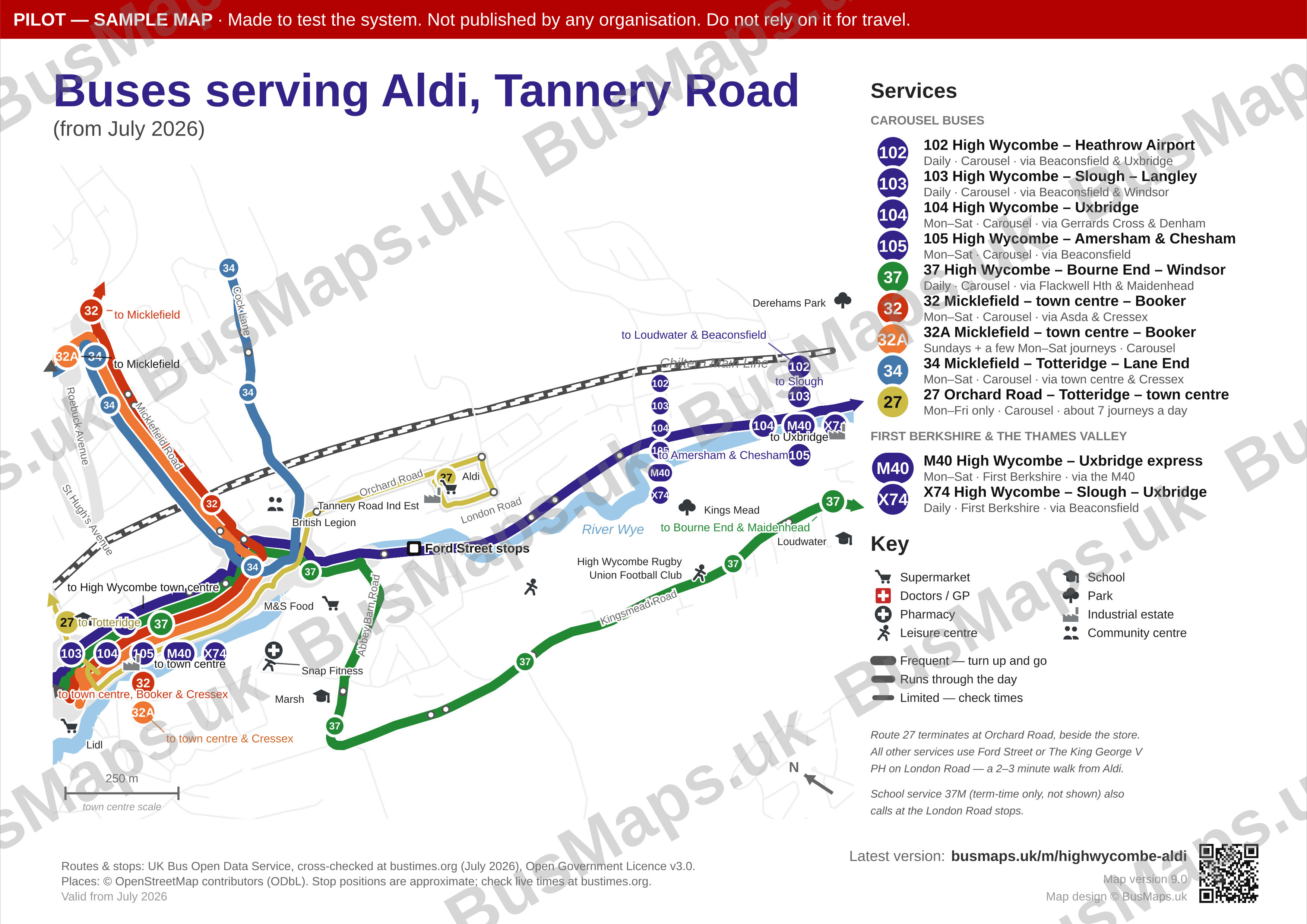
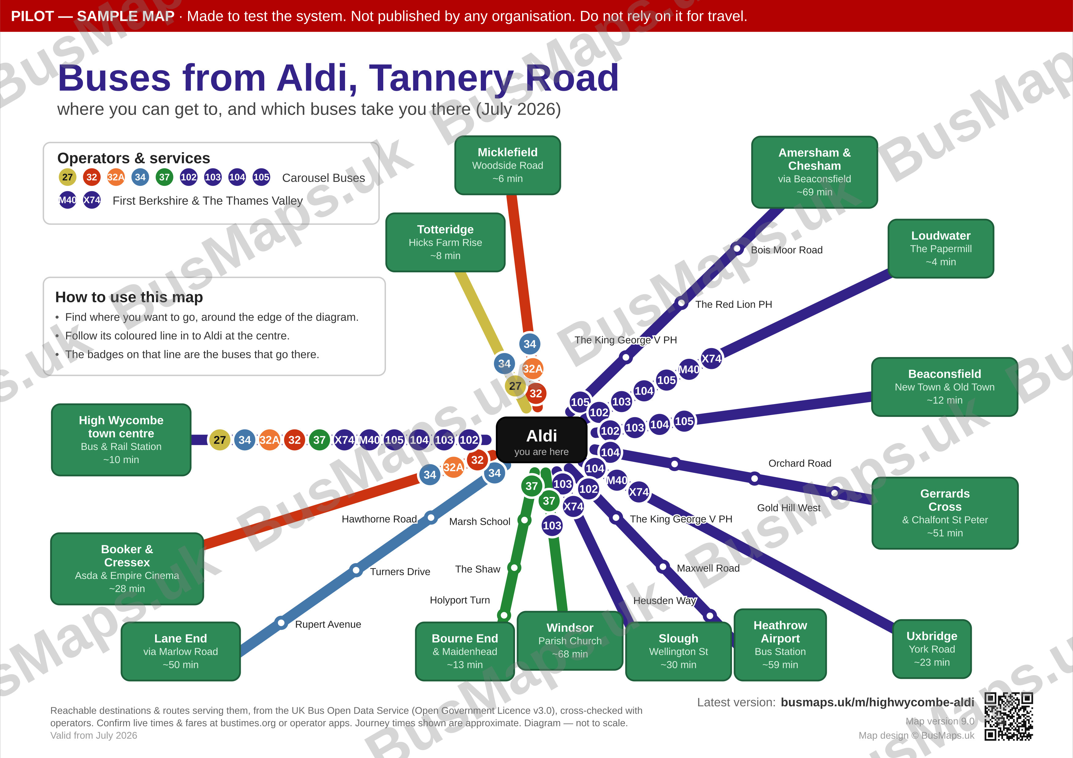
A supermarket on a busy main-road corridor: eleven services call here and fourteen places are reachable from the door. A place map copes with that by naming where you can get to rather than drawing every route.
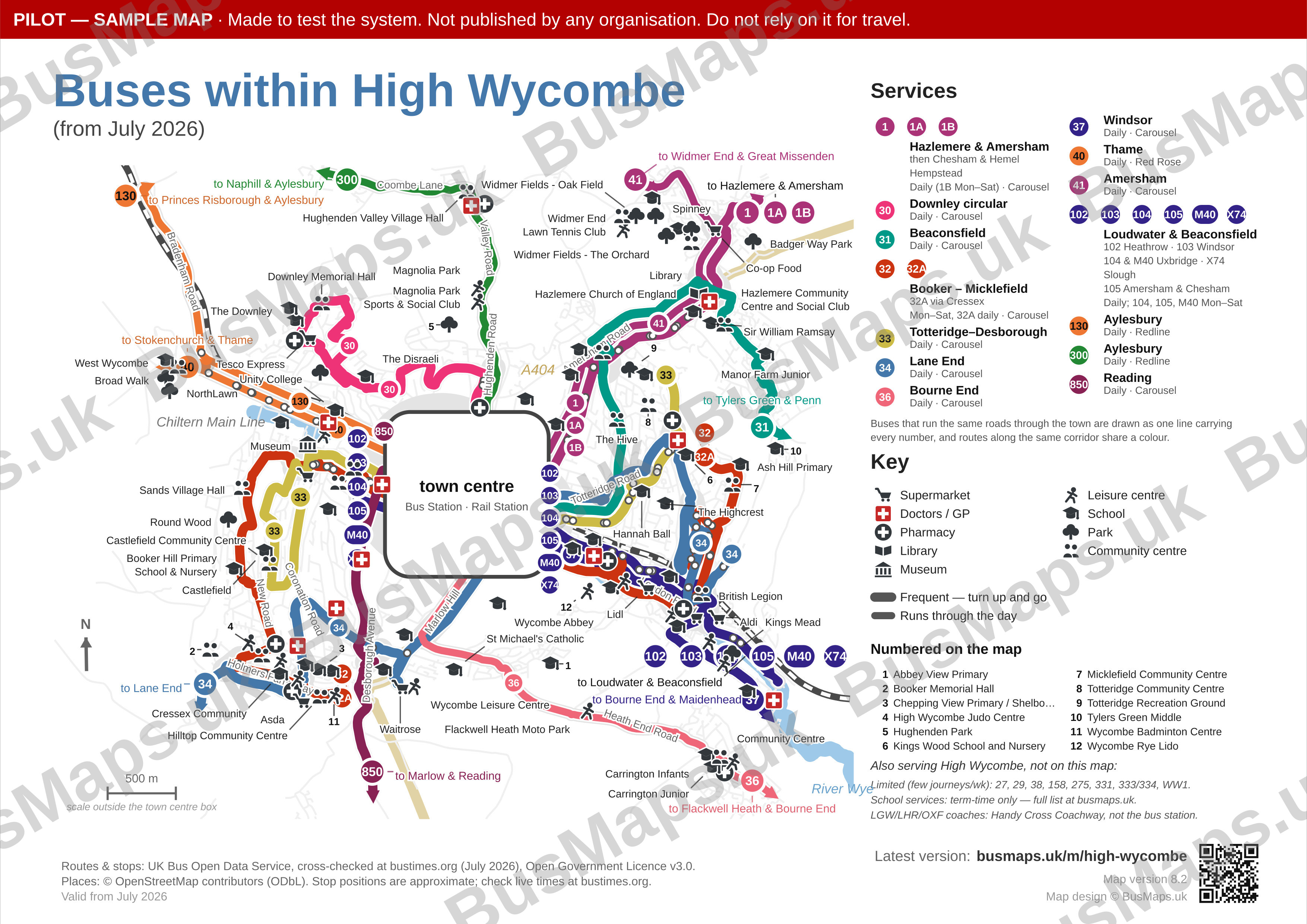
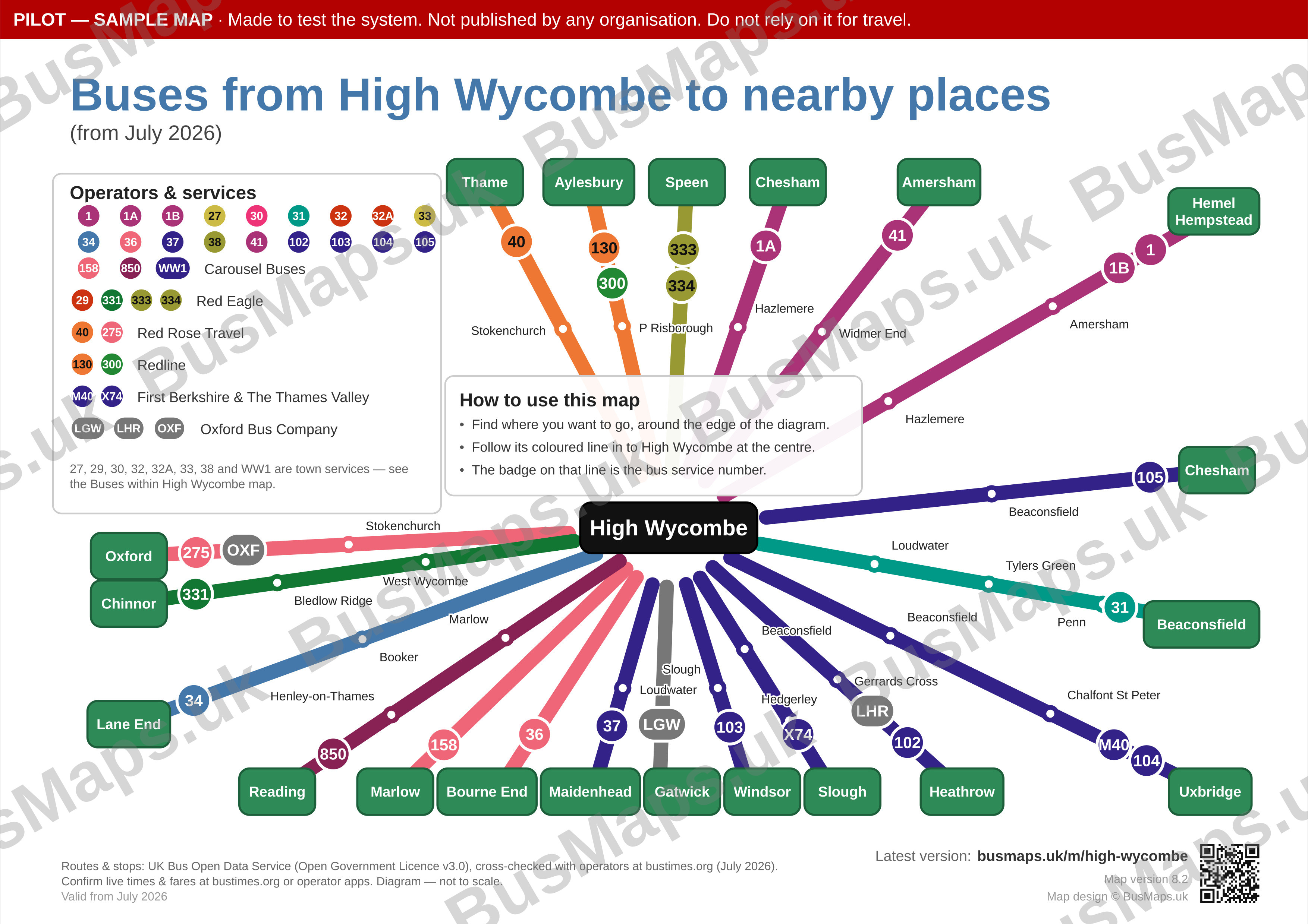
A big, busy town — and the hard case. Drawn the standard way it was unreadable; what you see here is the result of a documented process for making a complex network legible. How that was done.
Each map can also be produced as a straightened schematic, which you turn on yourself. Colours, labels and which of the standard outputs to include are all adjustable.
A fourth map, for one place rather than a whole area: the stops drawn at walking scale, and an index of where you can get to — listed by destination, not by route number — naming the stop to stand at. The stop letters come from the national stop register, so the letter on the map is the letter on the flag.
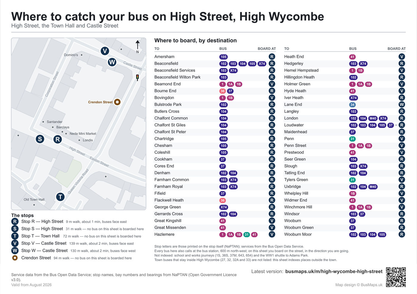
Six boarding points across one town-wide letter series — High Street R and S, Town Hall T, Castle Street V and W — and 54 destinations indexed against them. Three of the six index nothing and are still drawn, because one of those three is the flag directly opposite the busiest stop on the map’s own street.
Bus-station bays are numbered almost everywhere, so that form of the map travels well. On-street lettering is each authority’s own policy — Buckinghamshire letters its town-centre streets in a single series the way London does; its neighbours letter only their bus stations, and some letter nothing at all.
Where the stops around a place cannot each be named unambiguously, the map declines rather than guess: a letter we invented would be worse than no letter at all. So this one is asked for, checked against the register for your place, and quoted separately.
There is a live one. St Neots town centre carries a boarding plan on its third tab — five lettered stands on Market Square and 38 destinations indexed against them. The map above is High Wycombe because it is the harder case: two lettered streets 130 m apart, and nothing in a destination’s name to say which one you want.
At a town-centre stop it is a companion to the area map rather than a substitute — buses that never leave the town have no destination to index.
St Ives fits on one sheet without much argument. High Wycombe does not — and pretending otherwise is how you end up with a map nobody can read.
Three things, mostly: a lot of services, a dense centre where they all converge, and long through-routes that cross the whole map. The failure they cause is specific — lines end up drawn underneath other lines, so a route is on the map but invisible.
Rather than find that out at the end, the system measures it at the start: how many lines the map would draw, how many stops, how much of the area carries five or more routes at once, and how far that congestion stretches.
Those four measurements produce one verdict — GREEN build it normally, AMBER apply some remedies first, RED stop and choose a strategy.
It runs on the survey, before the expensive drawing work, which is what lets a quote be based on the actual difficulty of your town instead of a guess. How that feeds into a price.
Scored as it came out of the data, High Wycombe failed all four measures at once: 31 lines and 320 stops on one A4 sheet, over a square kilometre of the map carrying five or more routes, and congestion running right across it. Two-thirds of the typical route was buried under another one. That is a red verdict, and the honest response to it is not to build the map.
The fix is a documented sequence, applied in order and re-scored after each step: move the rarest services to a text list rather than drawing them; merge the route families that run along the same road into one line; stop routes at the edge of the town-centre box instead of tangling them through it; draw only the stops that are interchanges or termini; and where there are still more lines than there are distinguishable colours, colour by corridor and let the badges carry the route numbers.
The re-score came back 11 colour groups, 91 stops, nothing congested and nothing buried — inside the range of the towns that were straightforward from the start. Same town, same data, and no service left off the map — the rarest are named in the services list instead of being drawn as lines. The map above is the result.
The point is not that High Wycombe is difficult. It is that we can tell you it is difficult before anyone starts drawing, and that there is a written procedure for what to do about it.